Smooth shading begins with a readable value plan
Before asking how to shade a tattoo smoothly, ask what the shading must explain. It may describe a rounded form, separate overlapping shapes, direct attention or create a deliberate texture. A patch can look evenly grey and still fail to describe the subject. This free guide starts with drawing and tonal analysis; it does not provide settings, needle depths or a method for practising on a person.
In black and grey tattoo training, it helps to separate three questions: where the dark and light areas belong, how a transition should appear, and which practical technique a trained artist can safely use to achieve that appearance. An online theory lesson can help you reason about the first two. Practical application needs observation, feedback and appropriate supervision.
Build a five-value study on paper
Use five clearly separated values, from the paper's lightest area to a dark anchor. Make a simple sphere, folded ribbon or leaf shape readable with those values before adding tiny texture marks. The exercise tests organisation, not the ability to blend every edge into a continuous gradient.
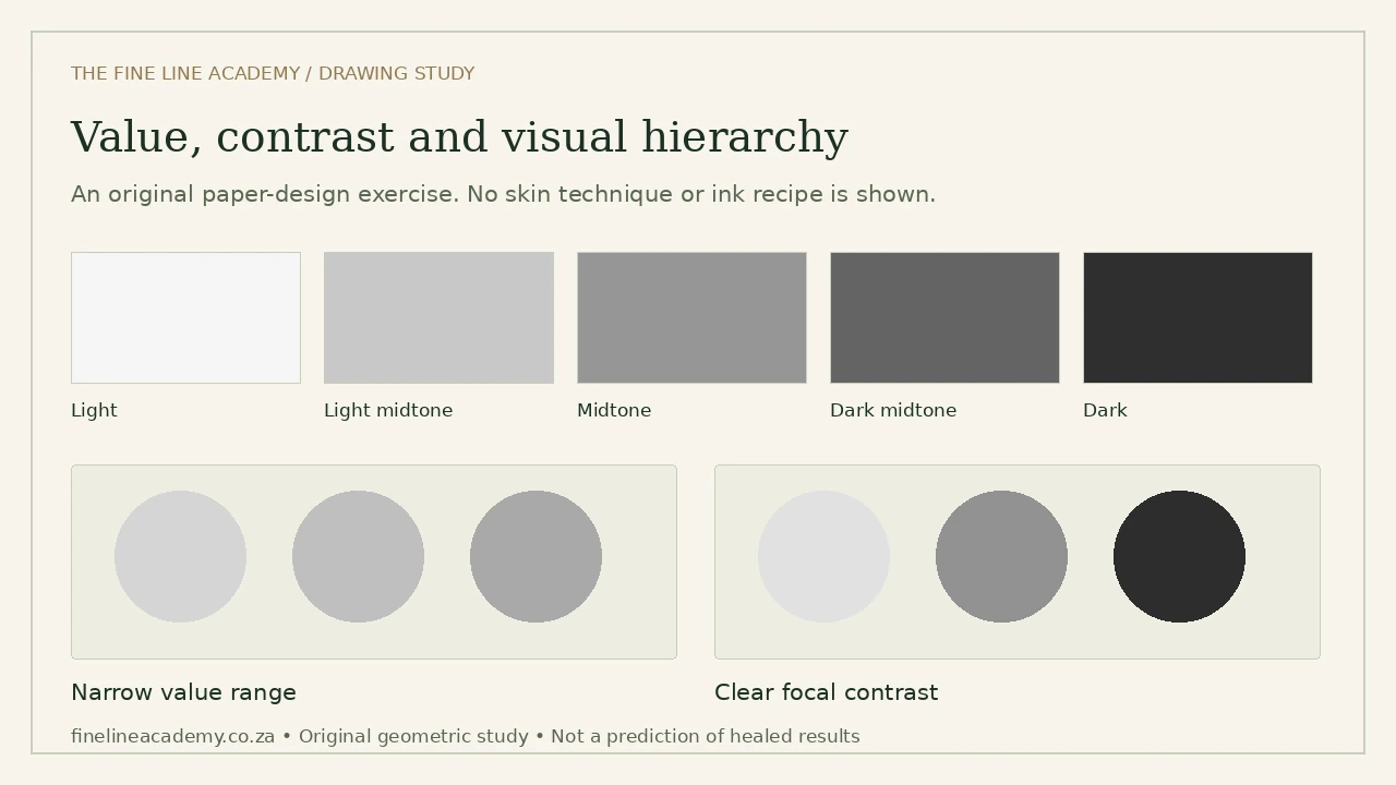
Try looking at the drawing at its intended size and from farther away. If the important shapes disappear, simplify the value structure before increasing detail. A dense field of attractive texture can compete with the focal point. Leave enough separation for the viewer to understand what sits in front, what turns away from the light and what is background.
Shading vocabulary: effects are not interchangeable
Whip and pendulum shading
These terms describe families of movement discussed in practical tattoo education. When studying a demonstration, identify the resulting gradient, the intended direction and how the educator evaluates consistency. A movement name does not specify a universal combination of machine, needle, hand speed and skin response. Copying the visible gesture without those decisions leaves essential information out.
Pepper shading, stippling and dotwork
These labels often describe deliberately visible marks or dot-based tonal effects. In a paper study, compare changes in mark density, distribution and contrast. A darker region should feel intentional rather than like an accidental clump. Dotwork can also be a compositional style rather than simply a way of filling a shape; context matters when reading a portfolio.
Curved magnums and soft transitions
A curved magnum is an equipment configuration, not a guarantee of smooth shading. When evaluating a course, ask whether it explains configuration, task selection and supervised feedback rather than presenting one cartridge as a universal solution. For a drawing exercise, make a transition using broad marks, then decide where a firm edge would make the form clearer. Softness everywhere can flatten a subject.
Shading without outlines
A form can be separated by adjacent values and edge contrast rather than by a continuous contour. On paper, remove a line from one edge of a simple object and use the neighbouring background value to make that edge readable. This is a visual-design exercise. It does not establish which practical approach is suitable for skin or a particular client.
Greywash ratios describe a mixture, not a finished tone
A written ratio does not tell you everything about a pigment's appearance. The products, concentration, dilution system, lighting and eventual application all matter. A diagram of five grey rectangles is not a formula for five ink caps. Do not transfer a pencil value scale directly into an invasive working procedure.
Learn the vocabulary of pigment and diluent instructions from the actual manufacturer, and ask a practical educator how the chosen system is documented and evaluated. Infection prevention remains relevant to colour study: the FDA warns about contamination associated with inks and non-sterile dilution water. FDA guidance
We do not supply a household recipe or an all-purpose mixing percentage here. The useful theory question is whether your design has distinguishable lights, mids and darks, and whether those choices support the subject.
Hand speed, machine speed and stroke: study the relationship
These variables belong to a system. Increasing one number does not automatically make a result smoother, safer or more realistic. Manufacturer specifications vary between models. In a course demonstration, look for an explanation of what is being changed, why it is being changed and how the result is assessed. See the equipment-literacy guide for the distinction between mechanical stroke, voltage and other decisions.
If you are learning from video, write a question when context is missing instead of filling the gap with an online rule of thumb. Good questions include whether the demonstration is on paper, synthetic material or living skin; how the educator defines success; and what the learner is expected to practise under supervision.
Realism needs selection, not every visible detail
Fur, feathers and skin textures can be studied as grouped directional patterns. Start with the largest masses and the light direction, then select a few texture changes that explain the form. Copying every strand can destroy the subject's overall value structure. A recognisable portrait likewise depends on proportion and larger relationships before small highlights are added.
Keep the reference rights clear and do not present another artist's finished tattoo as your original design. Separate an observation study from a design intended for commercial use. Our style guide compares realism, fine line, illustrative and dot-based approaches without turning another culture's visual language into a generic pattern pack.
A useful review checklist
- Is the main form readable before texture is added?
- Are light, middle and dark areas distinct at the intended viewing size?
- Do soft and firm edges serve a purpose?
- Does texture support the direction and form rather than cover a weak drawing?
- Can you explain the design decisions without relying on a machine-setting number?
The Black & Grey Shading Theory outline covers the related paper-based subject. Review its current release status before planning an enrolment. This guide is a public introduction, not a shading masterclass, practical competency assessment or authorisation to work on clients.
Published by The Fine Line Academy, an independent online education brand based in South Africa. This public guide supports informed learning choices; it is separate from paid student materials. About the Academy · Suggest a factual correction